As businesses all over the world focus more on their virtual presence, e-commerce websites or online shopping stores have become the norm. The best shopping carts must therefore be convenient, user-friendly and easy to access. In many cases, customers go through products, select some of them but drop out just before completing the purchase. This can be avoided by cart optimization.
If you wish to boost your online business, a well-equipped shopping cart can help you in grabbing deals. Let’s take a look at how we can design the best shopping carts.
Shopping Cart Type
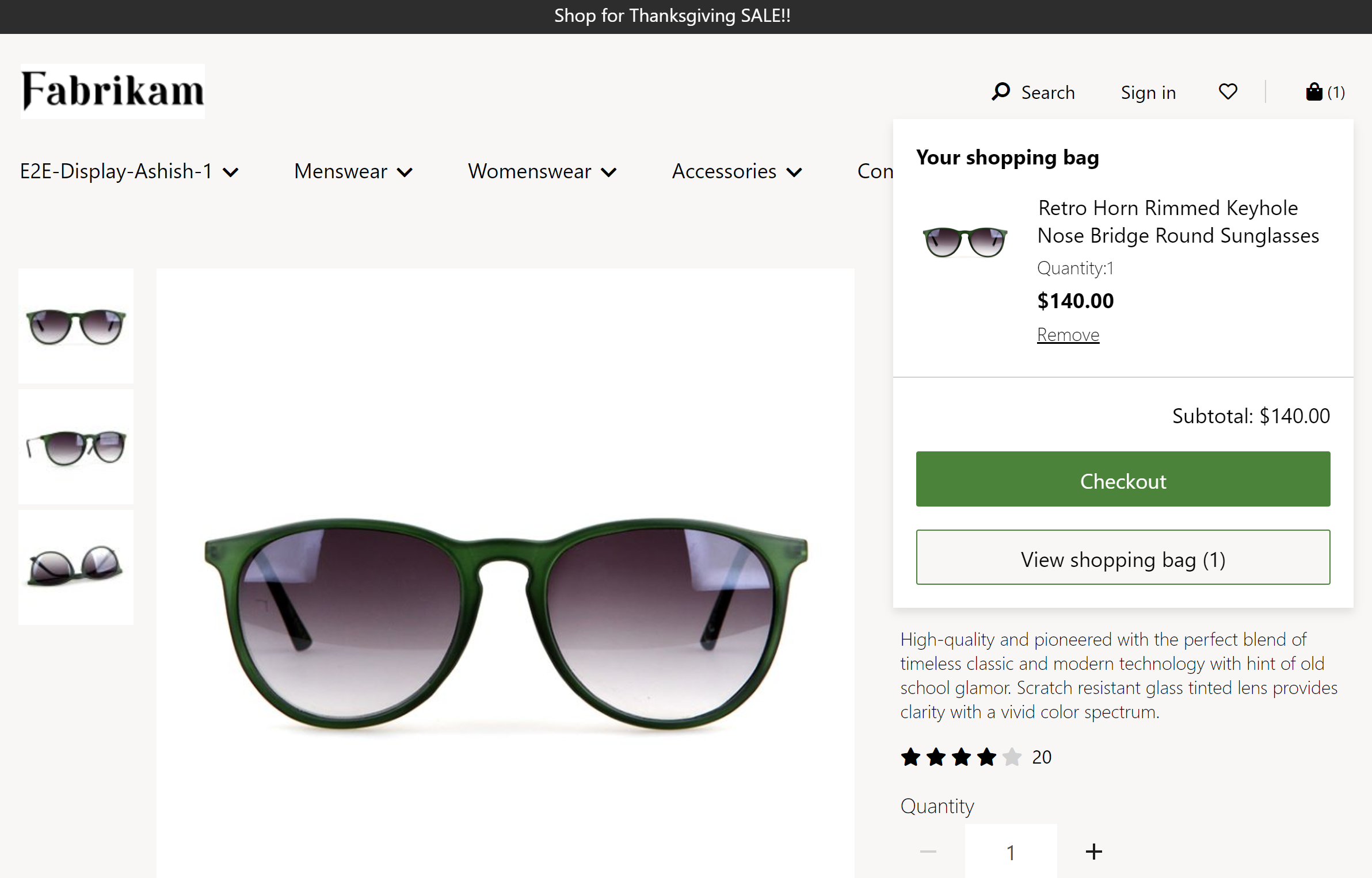
Mini Cart Example
E-commerce sites usually have two types of shopping carts, mini and full page carts. While the full page lays out details about the products, a mini cart can be designed in the sidebar or the page fold. It concisely shows the selected items, has a ‘continue shopping’ option and the ‘checkout’ button that will take you to the purchase page. It is a very good idea to include a mini cart in your page, and it will certainly uplift your shopping cart’s design.
Checkout Page
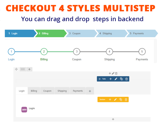
The checkout page leads to the purchase, and a step-by-step guide can help the customer to quickly complete the transaction. At this point, shopping cart optimization becomes necessary. So, when you are designing the cart, try to figure out the fields for sign-in, billing, shipping, payment, verify/edit one after the other. You can also direct customers directly to the checkout page from the mini cart itself. It is not only simple but also increases the chances of purchasing.
Confirmation And Email Notification
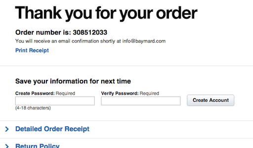
Customers expect an email verifying their purchase. So, don’t forget to have a clear confirmation page and an email notification service that works within minutes of placing the order.
Add Buttons For Select And Checkout

If you want customers to easily glide through to the checkout page, add visible buttons, possibly in contrasting colours, that guide the customer to add products to the shopping cart and proceed to pay. These can be placed directly below every item on the product list.
Opt For A Table Based Layout
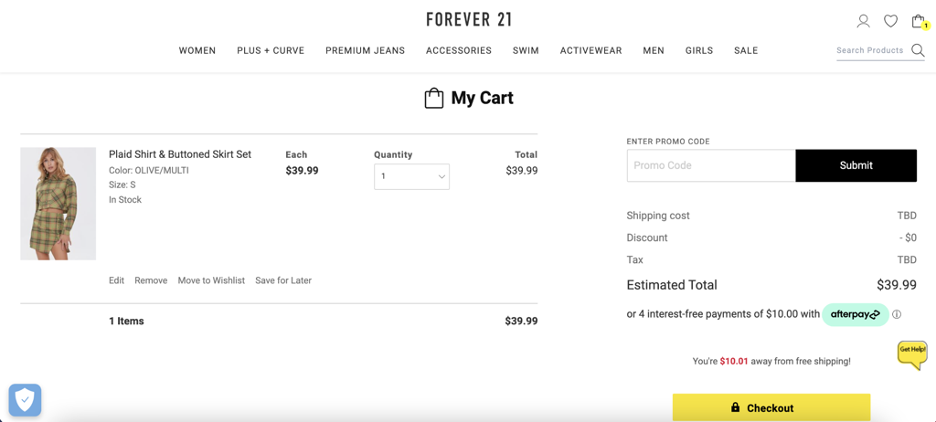
The layout of the shopping cart is very important for retaining customers. It should offer information without any interruption. Try to use a light background and standard fonts. Avoid complex page styling that can deflect customer attention. Images and product descriptions must be clearly mentioned in the table. Special attention must be paid to cart conversion optimization, which can be done with a flexible shopping cart that provides add/remove buttons or make customers comfortable with a progress bar that specifies the entire buying process.
Make ‘continue shopping’ Link Visible

Allow the customer to choose more products by offering a ‘continue shopping’ link in the cart. It must be clearly visible and should bring the customer back to the catalogue. It can be placed right next to the checkout button.
Avoid A Lot Of Form Filling

Customers are often annoyed with excessive form filling. Try to extract minimum information and ask them to fill out necessary fields only. This can keep the customer glued to your site.
Include Order Summary / Verify / Edit Options
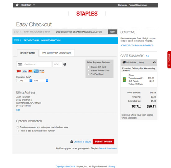
A successful shopping cart design must have a verify/edit option. It allows customers to check whether they are ordering correctly. It offers them a chance to verify orders before proceeding to the payment page.
Display Secure Shopping Logos
![]()
Customers must be confident to use your site. Win their trust by displaying secure shopping logos. Also, utilise the tools that are provided with your SSL certificate.
Mention Returns, Shipping, FAQ
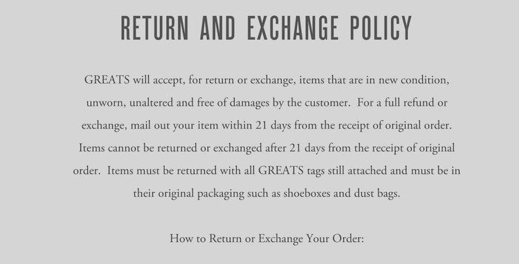
Clearly communicate return and shipping policies with your customer. Provide links to privacy policy, shipping details, returns and FAQ.
Specify Contact Details

Do not forget to specify contact details. It will instil confidence in shoppers, and they will be relaxed to know that the company can be reached easily.
Highlight Testimonials

Customer review has a positive impact on the shopper’s mind. So, do not hesitate to highlight testimonials offered by some of the clients.
Follow these simple steps to design your shopping cart, and you will be delighted with its outcome! Till then, happy designing.


Add comment